It’s been a fairly bad 15 years or so for economic growth, hasn’t it? There are plenty of ways of discussing this – charts of a line rising steadily up to mid 2008, turning sharply down and then never quite getting back on track. I have quite a few in this somewhat downbeat attempt from two years ago, still as relevant as the day it was posted.
Here is another way to look at it – through consumption, and prices. Consumption is the ultimate purpose of economic production, and prices are the major information tool within our grasp. Throw in quantites, and you have a fairly complete picture of economic change, from the consumer point of view. Brace yourselves: it looks like this.

Don’t throw up and close this down; I swear it makes sense.
The chart depicts the change from 2008 to 2023.
The horizontal axis shows how much more, in cash, the representive household spent on each category. The vertical axis is how much they got in that category. So, for example, we spent around 39% more on clothes, and got 32% more clothing for that.
The position of the bubbles tell us about technological change, and changes in habits/spending propensities.
There are a few obvious observations. Firstly, the blobs veer to the right, because there has been inflation; incomes are about 50% higher, so is spending. But, secondly, we get about the same amount of stuff as before – the chart is as much above the horizontal as below. If incomes had grown a lot, and prices and consumption habits were constant, the chart would look the same, but higher
Thirdly, the blobs MOSTLY sit along a straight line sloped line. A lot of the economy displays little in the way of productivity gains over those 15 years. Habits have changed – we have apparently increased our real consumption of household appliances, and cut that of package holidays – but these items neither helped nor hurt prosperity. Here we can zoom in on those bogstandard things:
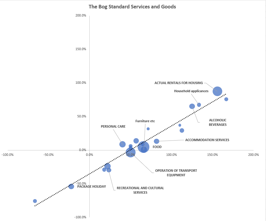
These are about 60-70% of the whole consumption basket* and mostly but not all services, and therefore classic cases of Baumol’s Cost Disease. Largely provided by humans, with steady real productivity, their price just rises with wages, more or less. Read your Vollrath and you learn that they are inevitably a bigger part of our future.
But we have had 15 years of technological change, no? Um, yes we have, but in terms of the weight in the final consumption basket, it isn’t so enormous. Here they are in blue:

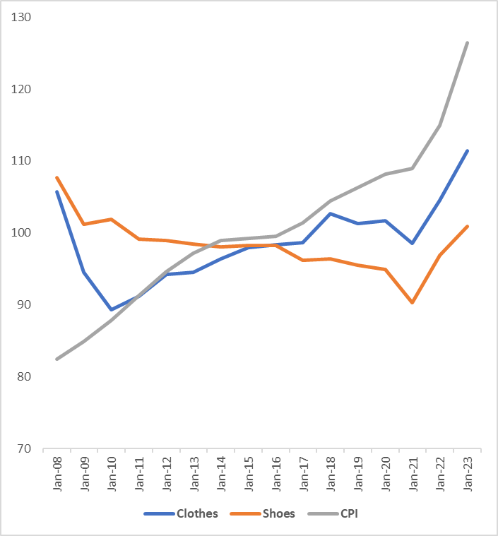
This buckets together quite a few varied items, for their virtue of being well above the line. All they have in common is that the fall in their effective prices means that they have contributed towards the consumer being better-off, all together. Their price has not risen with incomes. Ergo: prosperity. See clothes and shoes:
The only direct experience of the tech miracles from the smartphone era is found in “Audiovisial etc”, which means: Reproduction of Sound, Making photos and videos, “Data processing” i.e. computers. These have shown spectacular price falls. For example, the price series for “Data Processing Equipment” has fallen from 4998 in 1988 to 227 in 2008 to just 80 now. For the same £100, you can get 60 times as much of that processing as in 1998, and almost three times as much as in 2008. Unfortunately, this whole Audiovisual category takes up just 1.5%-2.5% of the consumption basket (that is why it it is a small blob). We get a lot more of it, but it ain’t much. More on that later.
Finally, there are the really bad news items – the commodities that have gotten way more expensive, and the services that appear to offer less for more. Here they are in red.

The obvious worst item – our energy bills – take almost 5% of the overall consumption basket (up from 3.3% a few years ago). Their price index is up from 62 in January 2008 to 235 in January 2023. Ouch.
Enough with the charts. What does this all tell us? I have some reflections: on technological progress, its relationship with economic growth, the importance of trade, and the importance of not forgetting demand.
Rapid digital technological advance does not generate huge prosperity directly via the consumer basket. The size of that “Audiovisual” dot is a reflection of what all these videos, music streaming and photo sharing mean, according to the statisticians. They haven’t ignored gigantic improvements – they are in the price indices. But we have responded by spending about as much of our wallet on them, and getting way more. Nice for us. But it is a 2% thing.
Technological advance has not shown up enormously in other goods and services. I find it striking how few other services have shown a big improvement – apart from financial! You may doubt the latter but think about it – online banking, pay by tap, all have improved a lot. But “Cultural services”, Restaurants, transport – these are much more about the price of fuel and of labour than digital tech.
Inelastic demand is a total downer. Gas is up 250% in price since 2008, but the ability to switch from it is limited. Hence its increase in the consumption basket from 1.5% to 2.0%. Ditto electricity. When you speculate about its role in the consumption of everything else, the problem of expensive energy looms larger and larger. A thesis of this book, while wacky at times, cannot be ignored: look out how energy improvements stopped.
The biggest story is a dog that didn’t bark. For the industrial era, prosperity has been driven by the constant improvement in price of big, important physical items. Cars got invented, and became a combination of cheaper and better, for decade after decade. We spent more on them (unlike “Audiovisual”), but we got much more back. Lots of physical goods were like this. Clothes. Mod-cons. Computers. The whole of modernity got created and cheaper.
But not so much, since 2008. Look at this ugly table. It compares the cash price improvement in a bunch of items for the years 1992-2008, and then the 15 years after.

They make up around a fifth of the consumption basket. Every item here stopped improving at the same pace (apart from “Other Financial Services”)- including the really incredible smartphone-era technologies at the top. Clothing, which fell in half in cash terms over the previous 16 years, started rising in price again. New cars just stopped improving. Look at air travel! The years up to 2008 were wonderful. Afterwards, just like anything else.
Why did this happen (or not happen)? There will be a lot of answers. The one that strikes me mostis a reflection on how we trade a lot of these items. For a long time, Western Consuming countries passively enjoyed the benefit of falling prices that stemmed from the incorporation of the East into our trading networks, and the constant improvement that their factories achieved. That came to an end. Maybe it had a natural limit. The Financial Crisis will not have helped. Rising Chinese wages likewise. The collapse in the pound from $2.00 to $1.20.
In particular, I think it is a real and important mystery that the explosion of network technology, the incredible GPT that is the smartphone, has not seemingly improved the productivity of other industries. Our ability to gain knowledge and promulgate it has skyrocketted. Why hasn’t that had real, physical consequences? This unbarking dog is one reason I remain sceptical, for now, about artificial intelligence transforming real growth. We still need to demonstrate how to make the last technological marvel do that.
For all that this post is already overlong, it just scratches the surface of the topic, and hides a lot. It doesn’t solve the problem of UK productivity, or even characterise it. Had the UK been a ‘better’ economy, selling for high prices a lot of valuable goods and services that the world really wants, our incomes would be higher, the pound stronger, and all these numbers would look different. What we choose to consume would not have constrained us.
But I find in all this data further confirmation that in a big, connected world full of mostly exogenous technological trends, our future prosperity is, unavoidably, to a large extent out of our hands. Each generation has tended to be more prosperous than the one before because of phenomena like factory managers organising production better, somewhere a long way away. Hairdressers, lawyers, politicians and teachers are better off because of exogenous changes they are not directly responsible for. Economic progress is largely a game of free-riding. It is humbling.
*Overall, I pulled in about 90% of the consumption basket for this

One thought on “A blob-chart way of dissecting Britain’s prosperity failure”